Designing with the Boho Color Palette
There’s a fun and casual yet chic and classy vibe that comes from a Bohemian-style or Boho design whether in home decor, fashion, or event motif. Although the entire look is achieved with a combination of several design elements, the result is a cohesively carefree and exciting overall aesthetic.
This design is all about the right colors and patterns. Choosing your boho color palette is the first thing you should do whether in fashion, interior design, or events planning. Then, you can work on completing the other elements depending on what you are designing for, be it for your living room redecorating project, a wedding, or just your outfit for the day.
By Eivan’s Team
Combining Paint Colors and Fabric Hues
An interesting characteristic of boho style is that it combines colors and textures in textiles, furniture, clothing, and other design elements. Generally, you’ll have to work with both hard (walls, furniture, jewelry, etc.) and soft surfaces (drapes, upholstery, clothes, etc.) when designing a bohemian interior. Earthy shades and jewel tones are the mainstays of the boho color palette – an entire spectrum of colors that could get intimidating for some.
Pantone and Hex Color Codes
Color swatches and Pantone guides are great for making the job of putting your color palette together a whole lot easier. Specific hex and Pantone suggestions from design websites make the process even simpler and hassle-free. There is no need to hire an interior decorator or a fashion stylist to pull off the trendy boho look that you are going for. Check out these combinations from various color trends:
- Soft Boho – this palette is a mix of pinks and tans in different shades. Hex – #e5af9e, #a3573a, #df9152, #eaa198, #fff4f1
- Neutral Boho – blues and nudes are combined in this boho palette. Hex – #eac0b3, #d49d81, #b46c53, #5580a0, #50697d
- Jewels and Gems – rich and vibrant colors of deep reds, emeralds, teals, and blues take the spotlight in this color scheme. Hex – #650000, #002750, #145048, #391b40, #153c49
- Baby Boho – this is a softer boho look that tones down conventional boho shades into pastels. Hex – #fdfbe5, #feeae3, #efdee4, #ccccd8, #cee2eb
- Earth and Sage – earth tones brown and terracotta mingle with shades of green for a rustic retro boho look. Hex – #788766D, #989E8B, #DDB8A6, #D49B7E, #C67F43, #893F04
Bases and Highlights
All the exciting colors in a boho color palette are best set against a white or neutral base. It’s usually not stark white that’s used in this palette. Try luminous white dove Hex – #FCFBF8 or cloud dancer Hex – #f1f0ec. If you want to go darker in your base color, you can go with plaza taupe #aea393 or even black satin Hex – #323536. For highlights, metallics and bold streaks are great as accents for a boho look. Pops of bright colors can also add depth and drama to the neutral base.
The Appeal of Bohemian Design
As far as fashion is concerned, the boho look appeals a lot to people with free-spirited nature. It’s great for a chill hippie look. Or, you can glam it up and for a nighttime boho gypsy look.
Boho is also a popular design theme for living rooms and places that are intended for relaxation and entertaining guests. It’s an effortless style that works well whether you are lounging around with family or having a vibrant party with friends. This flexibility is perhaps what makes boho decor appealing when it comes to interior design themes.
Saying “I Do” Boho Style
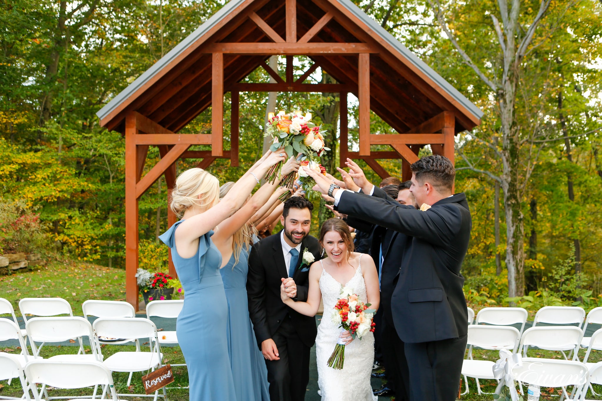
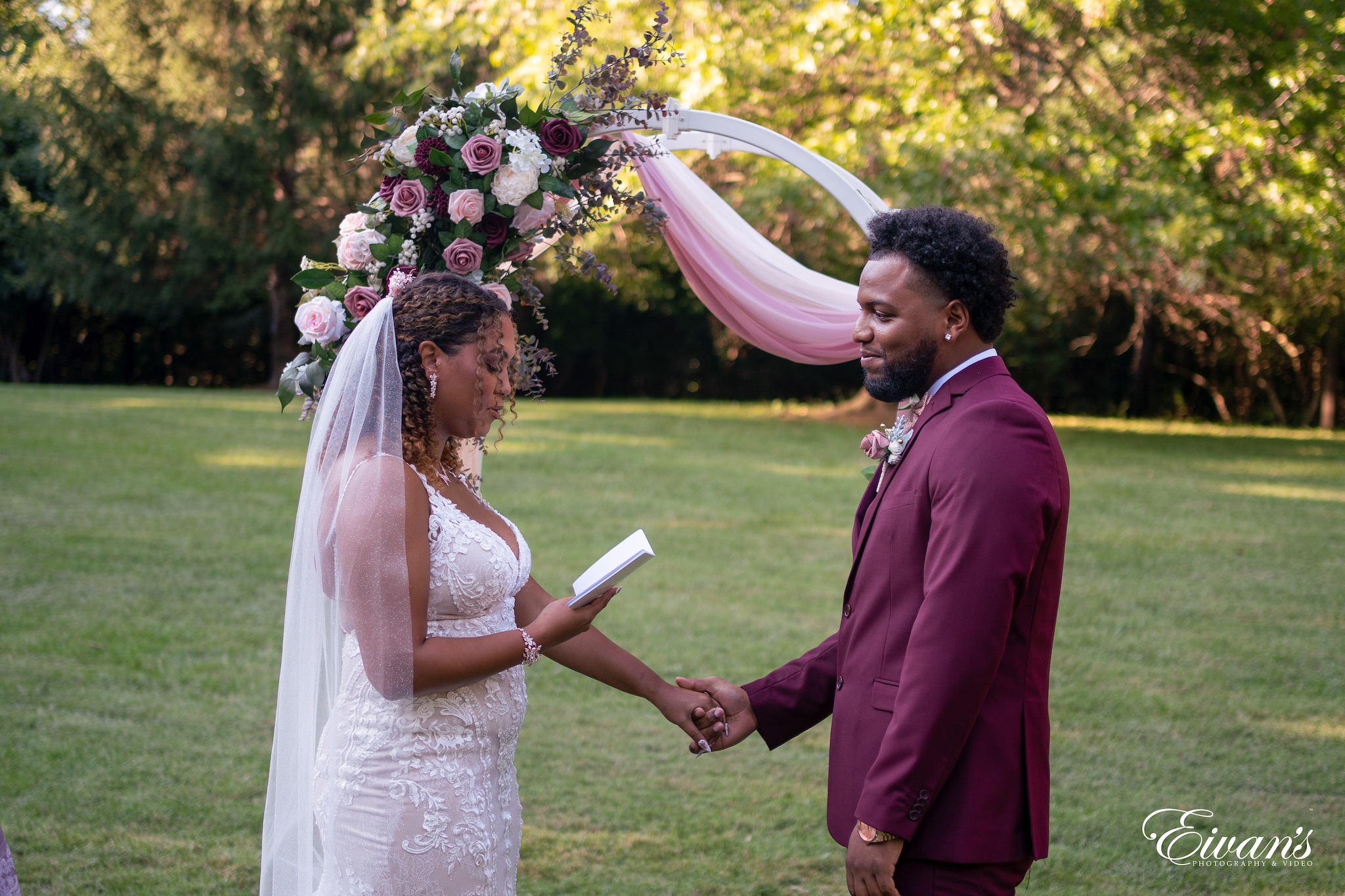
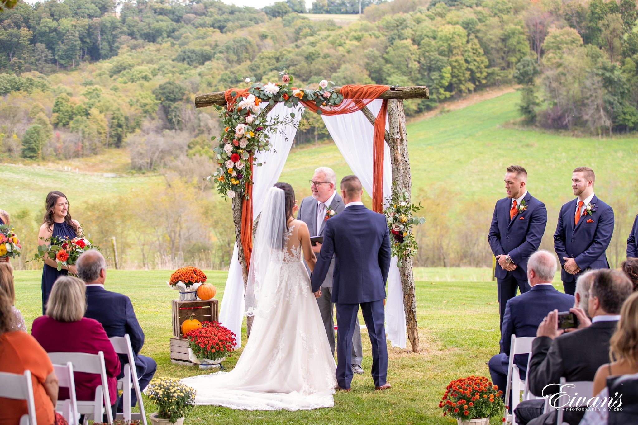
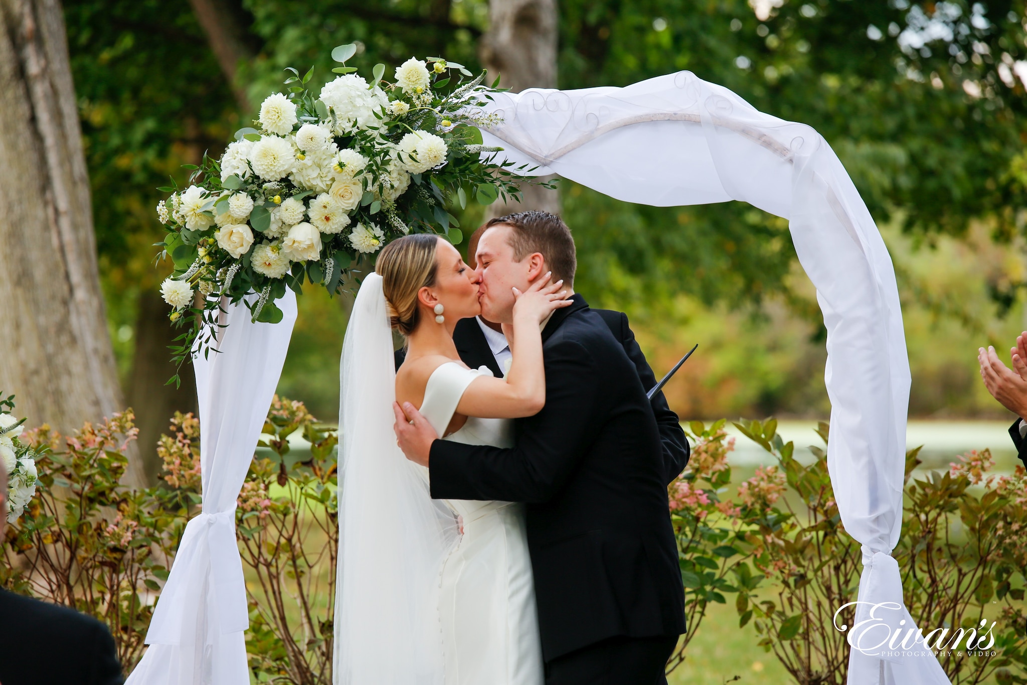
Boho weddings are refreshing as it gives off a vibe of effortless elegance. This kind of wedding does away with the uptight and reserved feel of black-tie formals. Flowy dresses in soft fabric replace the little black (or white) dresses. Rustic wood, greens, and vintage pieces are used for décor and table centerpieces. Low key opulence comes from highlights of jewel tones and metallic elements.
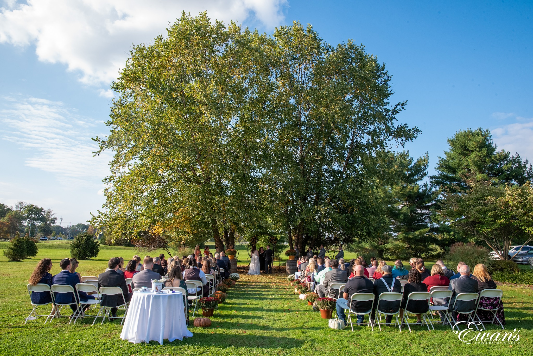
Weddings in boho style are usually held outdoors in expansive greens and against scenic landscape backgrounds. Wooden textures come from the surrounding trees and are added to the venue with pergolas and garden furniture. Flowers are ever-present in boho décor and in the wedding entourage’s dresses and accessories. Dresses are made of soft gauzy fabric that romantically billows in the wind.
Indoor boho weddings are possible too. You just have to bring the outdoors inside. Think of indoor gardens or perhaps try to recreate the outdoors in your indoor space. There are potted greens that you can arrange together to give you the landscape that you want in the background. On the tables, you can put crystals and stones as décor. You can have a tablescape of floral arrangements of flowers in soft pastel colors or succulents clustered together in ceramic plates or rattan baskets. You can also use vases and macrame plant containers with gold or metallic detail.
Complement your boho color palette with scents to make your event a multi-sensory experience. Scented candles, aromatherapy lamps, and incense sticks are some of those you can use to enhance the boho ambiance. Go for a combination of floral and woodsy scent that gives off a mystical feel.
One other great thing about this theme is that not everything needs to match. The various elements of your design should complement each other – remember, though, that you can also go overboard with all the mismatched elements and you’ll end up with a messy jumble of elements. Mix and match the various elements and tie them all up with a single unifying element.
Wedding Color Palettes Based on Popular Pantone Palettes
If you’re getting married in 2022, Pantone’s color of the year Very Peri Purple (17-3938) would go well with any neutral color palette. Here are some color combos from Pantone colour palettes you may want to consider for your wedding motif:
Golden Hour
A mix of neutrals and subdued hues with soulful touches of reds, the Golden Hour palette is great for sunset weddings by the beach. White Swan (12-0000), Pale Gold (15-0927), and Copper (16-1325) form the neutral base. Warm colors of Picante (19-1250), Orange Ochre (16-1253), and Apricot Ice (13-1020) add dramatic flair while brown shades of Chanterelle (16-1414) and Cappuccino (19-12220) bring everything together in harmony.
Balancing Act
This palette perfectly balances warm and cool tones. The shades of purple, pink, and red along with different hues of green would blend well in a garden setting or a venue with lots of greenery. Incorporate these colors into your wedding elements – Lotus (14-1905), Hawthorn Rose (18-1718), Elderberry (17-1605), Muted Clay (16-1330), Dried Moss (14-0626), Granite Green (16-5907), Burnished Lilac (15-1905), and Very Peri (17-3938).
Star of the Show
Earthy colors mixed with metallics let this palette exude elegance and style. The Star of the Show is a palette that creates an ethereal vibe. Anthracite (19-4007) gives a stark contrast to neutrals White Sand (13-0002), Cloud Dancer (11-4201), and Petrified Oak (17-1115). Volcanic Glass (18-3908), Deep Taupe (18-1312), and Plaza Taupe (16-1105) soften the contrast while Very Peri (17-3938) adds a lovely pop of color.
Go Boho Chic
If you are looking for effortless elegance, definitely go boho. It’s elegant but not boring with its creative color combinations. It’s flexible enough to go from low-key and relaxed to exciting and vibrant. Decorating and accessorizing in boho style is also so much fun because there are so many interesting possibilities in injecting this style into your interiors and fashion. You even have a great spectrum of colors to choose from to put together and tailor-fit your boho color palette to your own personal style.